There are many ways you can present numerical, chartable data by styling elements using CSS. Using CSS to style your data prevents you from relying on static images and increases your content’s accessibility.
Below, you’ll read about 8 excellent techniques for styling elements into beautiful, accessible charts and graphs.
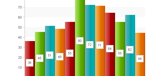
1. CSS for Bar Graphs

This tutorial showcases three ways of graphing data. The Basic CSS Bar Graph example involves a
element instead of a tag for semantically-correct HTML. The two other examples use a definition list and unordered list to graph multiple bars.
2. Accessible Data Visualization with Web Standards
 View Demo #1 – View Demo #2 – View Demo #3
Author Wilson Miner discusses the concept of accessible, standards-compliant techniques for data visualization mentioning the benefits, limitations, and alternatives in brief. The A List Apart article shows you three data visualization techniques using a basic structure of unordered lists.
3. CSS Vertical Bar Graphs

Eric Meyer shows us another technique for graphing vertical bar graphs using unordered lists similar to the "CSS for Bar Graphs" technique from Apples To Oranges.
4. Creating a Graph Using Percentage Background Images

In this technique, you use pre-made background images to shade in the appropriate data. The downside of this technique is that you’re limited by the pre-filled background images that you have and making more to suit your needs will increase the amount of classes you assign to your data - increasing the file size of both your CSS and HTML file as well as increasing the number of HTTP connections needed to render the page because of the background images.
5. Pure CSS Data Chart
This example uses a definition list for mark-up. A element inside the element is used to display the numerical representation of the shaded area, absolutely-positioned in the middle of the bar.
6. CSS Scatter Plot

A scatter plot is another great way to graph two-dimensional data. In the example, each data point is clickable, so a possible modification to this technique is to use a modal window that displays extra information about a particular data point.
7. Definition List Bar Chart

This technique shows two examples of styling definition lists into horizontal bar charts. Each definition list item is assigned a class that adjusts its width using percentage units.
8. Accessible Bar Chart

This technique showcases a method for semantic, accessible bar charts by using a table as the basic structure of the bar graph and using CSS to stretch a background image to its appropriate width.
No comments:
Post a Comment